
How to Use Color Confidently in a Spring Wedding Design
- Brandi Swanson

- Jan 27
- 4 min read
Design-focused couples often come to us with beautiful ideas—saved pins, color inspiration, and a clear feeling they want their wedding day to evoke—but also with one big hesitation: Is this too much color?
If you love romantic design and are drawn to feminine, cheerful palettes, but you’re unsure how to use color without it feeling overwhelming, dated, or “too theme-y,” you’re not alone. And the truth is, some of the most unforgettable weddings we’ve ever planned are the ones where couples leaned into color—confidently and intentionally.
At Next Chapter Weddings, we often describe this approach as soft but bold.
Let’s talk about what that really means—and how to do it well.

What “Soft but Bold” Really Means in a Spring Wedding Design
Soft and bold may sound like opposites, but in wedding design, they work beautifully together.
Soft design often comes from color palettes that feel romantic, feminine, and emotionally warm—tones that make you feel something the moment you walk into a space.
Bold doesn’t always mean dark or dramatic.
Sometimes bold is:
Choosing vibrant, joyful colors
Using brightness instead of neutrals
Taking a leap outside what feels “safe” or traditional
Bold design is simply committing to one end of the spectrum—whether that’s rich and moody or light, happy, and vibrant—and owning it.
Bold design is simply committing to one end of the spectrum—whether that’s rich and moody or light, happy, and vibrant—and owning it.
The Biggest Misconception About Using Color
One of the most common things we see is couples being afraid of color.
Many feel pressure to stick with neutral tones because they’re timeless, expected, or what they’ve always imagined a wedding “should” look like. But the weddings that truly stand out—the ones guests still talk about years later—are the ones that feel deeply personal to the couple getting married.
Sometimes that means choosing a color palette that isn’t common. And that’s not a bad thing—it’s often what makes the design feel intentional and unforgettable.
If color feels true to you, it will make sense in your wedding design when it’s used thoughtfully.

How to Use Bold Color Without It Feeling Overwhelming
This is where balance becomes everything.
Color works best when it’s layered—not applied everywhere all at once. One of our favorite places to introduce color first is florals, because they naturally soften bold tones and allow color to feel organic and elevated, especially for spring time wedding designs.
From there, color can show up in other elements—but not necessarily all at the same time. A balanced event allows the eye to rest and move through the space intentionally.
Where we often see couples overdo color is in:
Guest favors
Accessories
Multiple statement pieces competing for attention
These are usually smaller details, but when they aren’t considered as part of the big picture, they can feel disconnected or distracting.
One of the most effective tools we use as planners and designers is creating digital mockups and visual layouts. Being able to step back and see everything together helps ensure bold choices feel cohesive rather than chaotic.

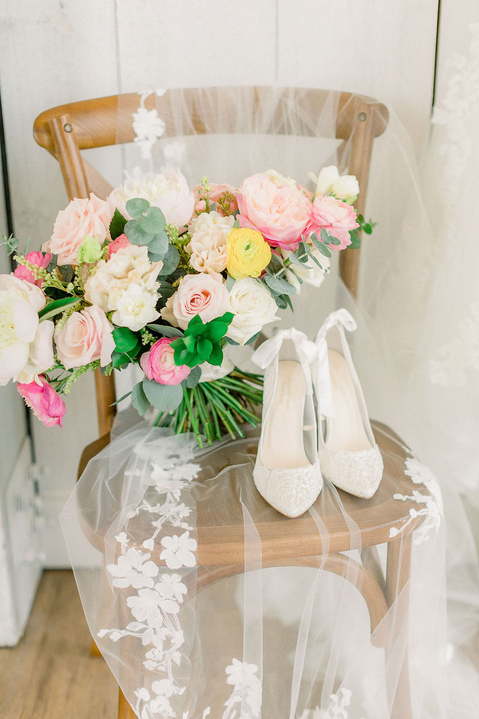
Why Pink, Yellow, and White Are Perfect for Spring
Pink, yellow, and white are quintessential spring colors for a reason.
They evoke:
Growth
New beginnings
Joy
Warmth and optimism
This palette feels happy and romantic without feeling juvenile when it’s styled correctly. It works beautifully for garden weddings, but it’s also incredibly versatile—equally stunning in estate venues, classic indoor spaces, or historic settings.
While it may not be the obvious choice for a moody or speakeasy-inspired wedding, even then, color can surprise you when it’s done with intention and restraint.

What Couples Often Underestimate About Color Design
Choosing a color you love is easy. Executing it across an entire wedding day is where things get complicated.
What’s often underestimated is how many moving parts are involved—and how visually impactful certain elements are. A linen, a dress, or a large installation carries far more visual weight than a small accent piece.
Sometimes a bold color works best as a supporting detail rather than the star of the show. Knowing where to place color is just as important as choosing the color itself.
How a Planner Helps Bring a Mood Board to Life
A wedding planner who understands design doesn’t just see inspiration photos—we see translation.
With just a few images, we can identify what matters most to you, interpret your vision, and collaborate with vendors using textures, swatches, and materials to bring everything together seamlessly.
We also help filter out the noise. There are a lot of opinions in wedding planning, and it’s easy to get pulled in too many directions—especially when DIY-ing design decisions quickly without seeing the full picture.
Our goal is always to help couples stay genuine to themselves, slow down, and design intentionally instead of collecting details that don’t ultimately work together.
Some of the most A-H–MAZING weddings happen when couples trust their instincts, stay true to what they love, and allow themselves the space to design thoughtfully instead of rushing decisions.
Color is powerful. When it’s used with intention, it tells a story—and that story should always be yours.
Ready to Bring Your Vision to Life?
If you’re dreaming of a wedding that feels romantic, intentional, and beautifully designed—but could use a little guidance to bring it all together—our team would be honored to help.
Next Chapter Weddings is a Texas-based wedding planning and design team serving Houston, San Antonio, Austin, and wherever our clients’ big dreams take us.
✨ Let’s create something beautiful together. Reach out through our website to start the conversation—and follow along on Instagram @next_chapter_weddings for more design inspiration and planning tips.
Your next chapter deserves to feel just as good as it looks.


Comments